The 70/30 rule in art is a flexible way to think about dominance and contrast: give one visual quality a larger role and let a contrasting quality play a smaller one. For example, an artist might pair a broad, simple area with a smaller area of detail. The percentages are a rough starting point, not a formula for judging whether an artwork is good.
The phrase can be applied to different things, including shapes, colors and levels of detail. It is most useful when you decide which relationship you want to explore rather than trying to make every part of a composition fit the same ratio.
A simple 70/30 example
Imagine a painting with a broad, quiet background and a smaller cluster of detailed objects. The background gives the composition a sense of unity, while the objects provide contrast and a place for the viewer to look more closely.
You could think of the quiet area as roughly 70% of the image and the detailed area as roughly 30%. But those are estimates: the shapes do not need to divide neatly, and the result does not have to be measured precisely.
Physical area and visual attention are different things. A small, bright or intricate area can draw the eye first even when it takes up relatively little space. If the objects feel lost, you might give them more contrast or room. If they make the scene feel crowded, you might simplify them or expand the quieter area.
How to try the idea in your own art
Begin with a small sketch and choose one kind of contrast. Working on a simple version first makes it easier to change the balance before you invest time in details.
Large shapes and small details
Block in a few broad shapes, then concentrate smaller marks in one part of the image. In an imagined landscape, for instance, you might keep much of the scene open and add more texture around a group of trees.
Step back and look at the sketch. Can you see the main shapes before noticing the individual marks? If detail is spread evenly everywhere, try simplifying one section. If the trees are hard to notice, strengthen their shape or contrast before adding more texture.
Dominant and accent colors
Try using one color family across much of a composition and a contrasting color more sparingly. The accent can appear in several places; it does not have to form a single block.
Look at how the colors behave together. A small amount of a strong color may attract more attention than a larger muted area. If the accent pulls the eye away from the subject, reduce it or move it. If it disappears, try a clearer contrast. The goal is a useful visual relationship, not an exact count of colored sections.
Quiet and busy areas
In an imagined still life, you might keep the background relatively plain and concentrate patterns or small objects near the subject. This can make the detailed area easier to notice without requiring every surface to be elaborate.
“Quiet” does not have to mean empty. It might mean fewer lines, simpler shapes or less contrast. Similarly, a busy area need not contain many objects; a small section with intricate marks can be visually active.
Compare two versions before adding detail
One practical test is to sketch the same idea twice. In the first version, give the contrasting elements roughly equal space or emphasis. In the second, let one lead clearly. Neither sketch needs to be polished.
Put them side by side and ask:
- Where does your eye go first? Is that where you want it to go?
- Does the smaller element stand out, or does it disappear?
- Does the dominant area feel unified, or would a little variation help?
- Is the contrast supporting the subject, or distracting from it?
You may find that the uneven version is clearer but too quiet for your idea. Or the more even version may have energy but feel difficult to read. Adjust one relationship at a time, then look again. The comparison is more useful than trying to prove that a sketch meets a percentage.
When an even balance may work better
A 70/30 split is not always the answer. A nearly even division may suit a symmetrical design, two equally important subjects or a composition intended to create tension. Several competing focal points can also be a deliberate choice.
The tradeoff is worth noticing: a dominant area can make an image easier to organize, but a very predictable arrangement may feel too calm for the effect you want. An even balance can create its own interest, although it may give the eye less direction. Choose based on the mood and emphasis you want, not on the rule alone.
Is it the same as the rule of thirds or 60-30-10?
No. These ideas address different decisions:
- 70/30 in art is a loose way to explore dominance and contrast, such as a large simple area against a smaller detailed one.
- The rule of thirds divides an image with two equally spaced horizontal lines and two equally spaced vertical lines. It suggests using those lines or their intersections to help place important elements.
- The 60-30-10 decorating approach is a way to plan a room’s colors using a dominant color, a secondary color and an accent.
You can use the ideas together, but their numbers do different jobs. A focal point placed near a rule-of-thirds intersection, for example, does not have to occupy 30% of the image. Likewise, a room color plan does not determine where a picture must hang.
Using the idea for a kitchen art display
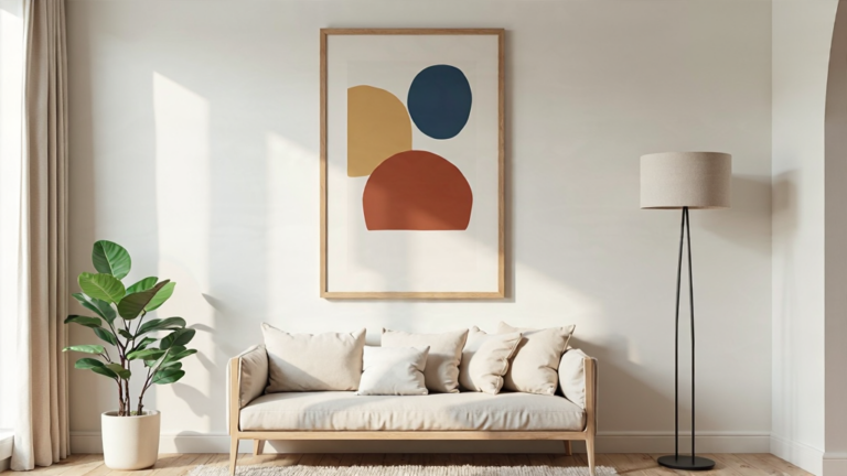
You can borrow the principle when arranging a wall: choose what should lead visually, then give it some breathing room. That does not mean art should cover exactly 30% of the wall. A picture’s visual impact depends on its surroundings as well as its dimensions.
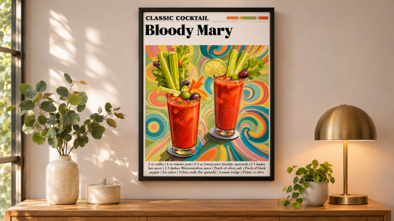
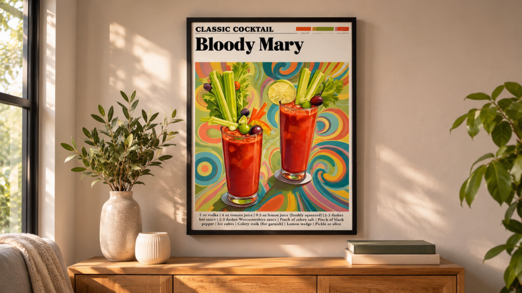
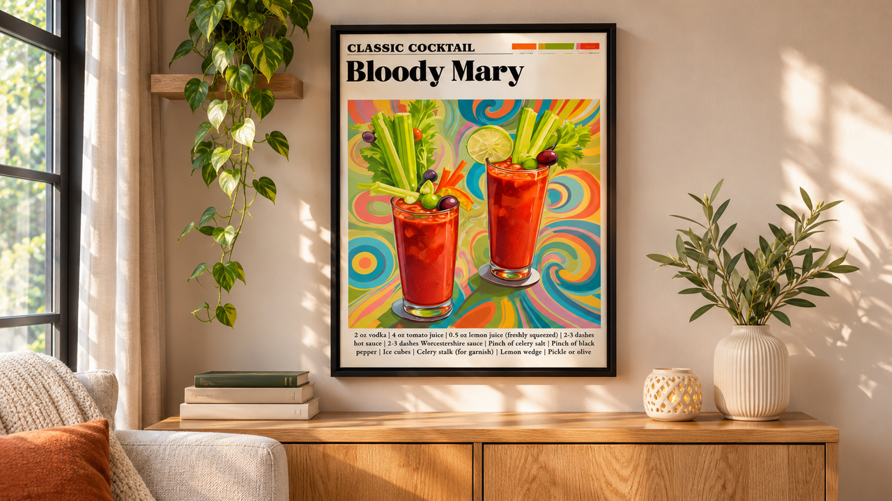
For example, a single Bloody Mary print could be a focal piece near a bar cart. Before choosing a position, cut a paper template to the approximate dimensions you are considering and hold it against the wall. Step back to a usual viewing spot and check whether the arrangement feels settled or crowded.

If the print seems lost, try a more prominent position within the available space. If the area feels busy, remove a nearby decorative element or allow more separation. Consider cabinets, outlets and frequently used surfaces when deciding where art belongs. A clear focal point is helpful, but it should not get in the way of using the room.
For help measuring and testing an arrangement in a tighter space, see how to choose wall art for a small room without overcrowding it.